pico-view:
March 2023

Hello Pico-View Reader, this March issue is the third in the series. This month has been full of fantastic releases. Thank you to the writers, contributors, and all supporters, that includes you reader! We thank you from the bottom of our hearts.
And with that, have fun adventuring through the pixels and paragraphs of this issue of the Pico-View web-zine!
Authors:
Jangus Dunch, LokiStriker, SquidLight, Achie, Nerdy Teachers, and Marina
Contributors:
Chaneburgerz, Jusiv, castleview, ohhcurtains, Schoonsy, TroubledKarma, Glimm, Luchak, Ricsidiscord, Godmil, Numa, Michał Rostocki
Contents:
-Cover Art by Chaneburgerz
-The Making of What's Inside Pixel Art - Jangus Dunch
-The Joy of Multi-line Strings - SquidLight
-Featured Game Review: Calico - Achie
-On Integrating Sound Effects with Music Compositions - LokiStriker
-Neon Sprites - Nerdy Teachers
-Random Reviews
-Pixel Art Gallery - Jusiv
-Tweet-Cart Gallery
-Prototype Party
-Closing Remarks
Making of What's Inside Pixel Art
by Jangus Dunch
Hello! I’m Jangus Dunch. I make low-poly models with picoCAD, and pixel-art with the pico8 color palette. Sometimes I like to mix them together!
How did all this start?
When I started picoCAD I fell in love with the pico8 colors, and I wanted to make pixel art with them. I also love drawing and designing characters. When I am drawing, I like to create worlds inside worlds. I really like going into the detailed anatomy of that character, because it creates room to be playful, explore, and add easter eggs. For me, it is really fun and it makes me want to create more. I was really inspired by this pixel artist, Guandanarian to create the What’s Inside series. In his current works, I really like how he fills space with many features and animations.
My Process
First, I thought about what I enjoyed and liked. For example, I made this What’s Inside Mega Man pixel art.
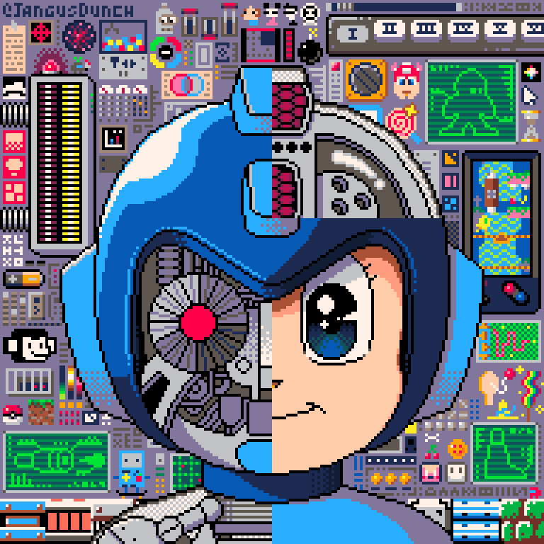
What’s Inside Mega Man - Jangus
I made that because I really like Mega Man and enjoyed watching the animated series as a kid. Using that knowledge, I then came up with a couple of themes relating to the subject of what my art was going to be about.
One thing that makes really good art is contrast. So I thought about where I can find contrast in the theme. Mega Man is a robot that has the heart to save others. That is good contrast; a robot with a heart that feels emotions.
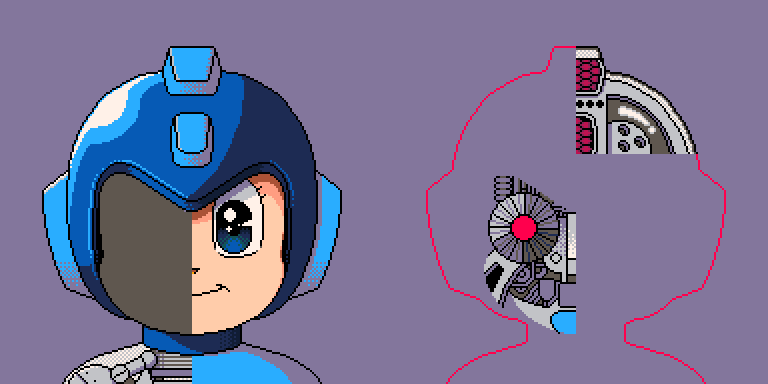
Robot/Human Contrast of Megaman - Jangus
A good way to portray this was by showing the human-like exterior and robot-like interior. On the outside, Mega Man is a cute character, but on the inside, it’s a lot of detailed machines. I also really love pixel drawings of detailed machinery, tech, etc. I wanted to fill the drawing with details of things that relate to Mega Man, a lot of easter eggs, and other things that I personally like.
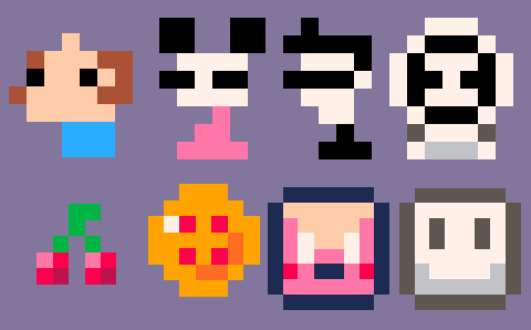
Can you spot what these are from and where they are in the background?
My process for all the What’s Inside series is very similar. For BMO I had an idea to combine it with picoCAD, but what should I make 3D polygons of? The buttons! The buttons are perfect to be made as low-poly 3D art.
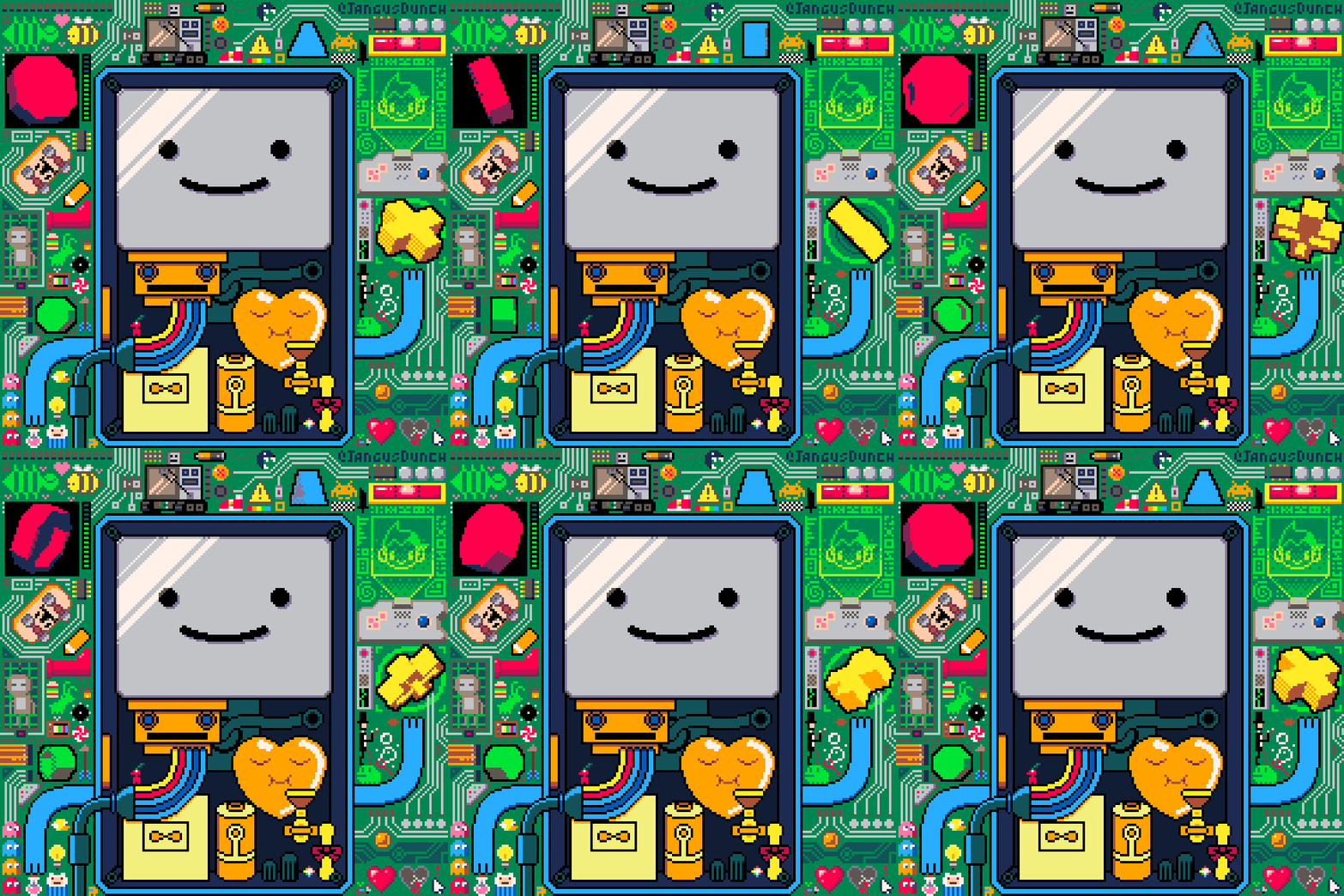
What’s Inside BMO
As a fan of Adventure Time, I added as many references as I could fit. To match the theme I made parts of the background look like a circuit board.
In the episode “Guardian of Sunshine”, Fin plays the game called Guardian of Sunshine using BMO. I thought it would be perfect to add references to Bouncy Bee, Hunny Bunny, and Sleepy Sam. Since the piece is related to tech and gadgets, I added Ice King’s computer projecting a hologram of my avatar (Astro boy).
Pixel art with PICO-8 colors gives me the same feeling as building with legos. It always makes me want to create worlds, add details, and dissect things. It is what motivates me, and keeps me interested to create. The more I make, the more I want to make people guess and explore. I really want to share this with others and inspire others to do and feel the same in their own way.
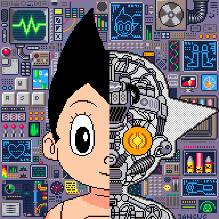
What’s Inside Astro Boy
The Joy of Multi-line Strings
by Squidlight
One of the things that I find very useful when writing carts is multi-line strings. Most of you have probably seen these in the form of multi-line comments ( --[[ ]]) but they're also very useful within the code itself.
The basic format of a multi-line string is two square-brackets [[ to open the string and two more ]] to close the string. Anything that is typed in the middle will be preserved, including new lines.
Where Multi-line Strings Can Help
Take for example if we had the following code:
function _draw()
	cls()
	rect(20,20,100,60)
	print("i wish there was a", 22,22,7)
	print("shorter way to", 22,28,7)
	print("write a dialog.",22,34,7)
	print("but maybe...",22,46,7)
end
(35 Tokens)
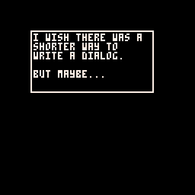
We can rewrite the whole thing to use just one string:
function _draw()
	cls()
	rect(20,20,100,60)
	print(
[[i wish there was a
shorter way to
write a dialog.
but maybe...

		there is.
]],22,22,7)
end
(17 tokens)
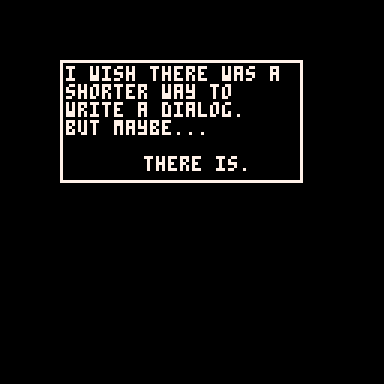
Note: PICO-8 keeps track of the indent for us so we don’t even need to align the lines separately. How cool is that?
There is another use for multi-line strings that should be considered. Sometimes you want to do something that requires splitting a string into multiple tables. For this we often use the split() function which by default splits a string by commas (,).
This can be used for a dialog system to display the text line-by-line, for example:
text="hey john,have you seen the dark,cave?,,its very scary."
--split into a table
lines=split(text)
The problem with doing this is it can be very hard to read the entire line of code within PICO-8:
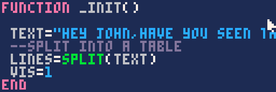
This is where multiline strings can really help. split can split text by any character including new lines which are represented as \n. We can therefore rewrite this code as follows:
text=[[hey john
have you seen the dark
cave?

its very scary.]]

--split into a table
lines=split(text,"\n")
This is much easier to read in the PICO-8 code editor as well:
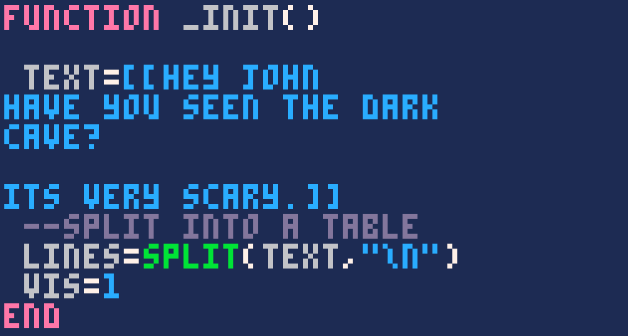
This does the exact same thing as the single line string, but instead of splitting by commas, we are splitting by new lines. “\n” is control code for new line. Pretty cool right?
This can be a very efficient way of creating a table of strings token wise. This is due to the fact that a single multiline string is always one token.
⚠️ Control codes don’t work with multiline strings.
For more information about how split can be used please see the manual.
Here is an example of code that uses a mutli-line string and displays a new line of text every time the X button is placed.
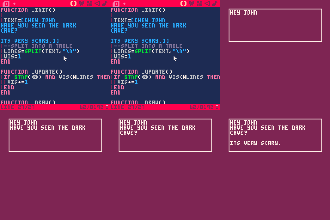
What usages for multi-line strings can you come up with?
- SquidLight
Featured Game Review
When Board Games Meet PICO-8
by Achie
Tabletop games.... Weird start to a video game review, right? WRONG! Somewhat ... If you are not familiar with the game in the title, then let me tell you a story about a game that made me curl under the desk, like the cat on the box art, and cry myself to sleep because my brain is too stupid to understand basic rules.
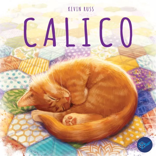
Calico is originally a board game, those games you play with the mythical pokemon so-called friends on a table on a weekend night. Released in 2022 by Keving Russ and Beth Sobel the game invites you to make your own quilt and compete with your friends for points!
Why am I still talking about a board game? Because LouieChapm was like "I'm gonna make my own Calico, with tokens and restrictions" and went ahead to push this whole game into the magical world of PICO-8.
Review
Released on the 11th of March, this game captures the cozy little feel of the original game perfectly. After teasing us with in-progress footage for so long LouieChapm finally released the game both on Itch and of course the Lexaloffle BBS for all of us to enjoy.
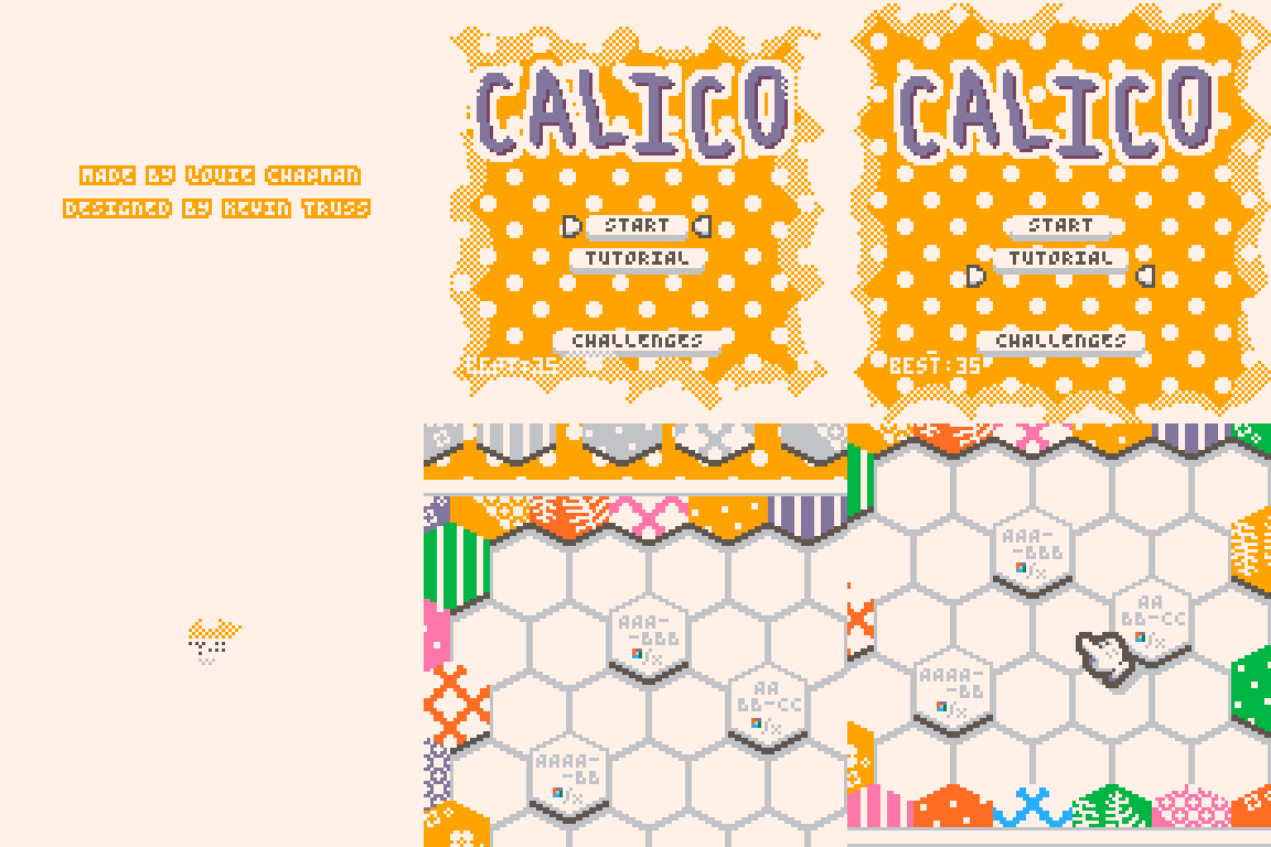
The main goal in the game is to sew new patches onto your quilt, satisfying certain conditions to gain buttons and favor cats who will come and rest on our quilt, granting points in the end.
Controls are simple to learn. You move tiles around with ⬅️⬇️⬆️➡️, enter into a free-looking mode with ⭕, and chose/place tiles around the map with ❌.
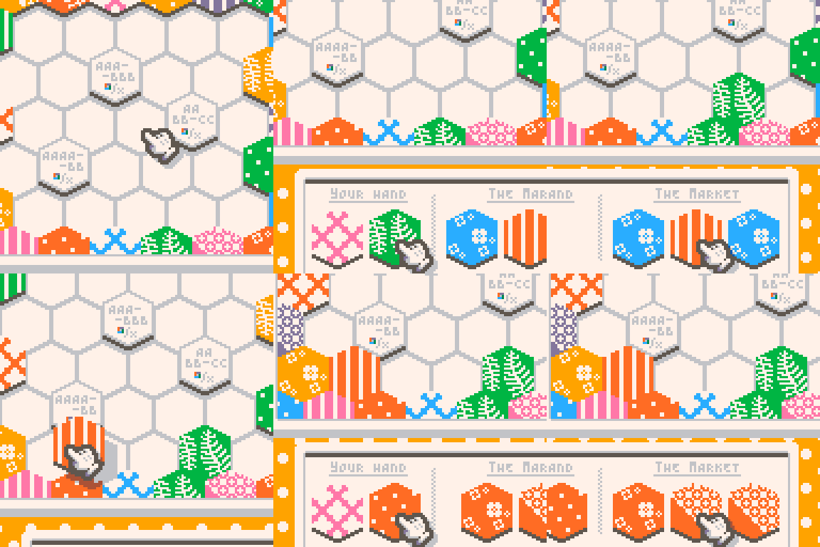
What are these conditions? Let's take a look, one-by-one and let me explain them quickly. One of the simplest to understand is the 3-group rule. If you have a group of 3 colors on your board next to each other, you gain a button!
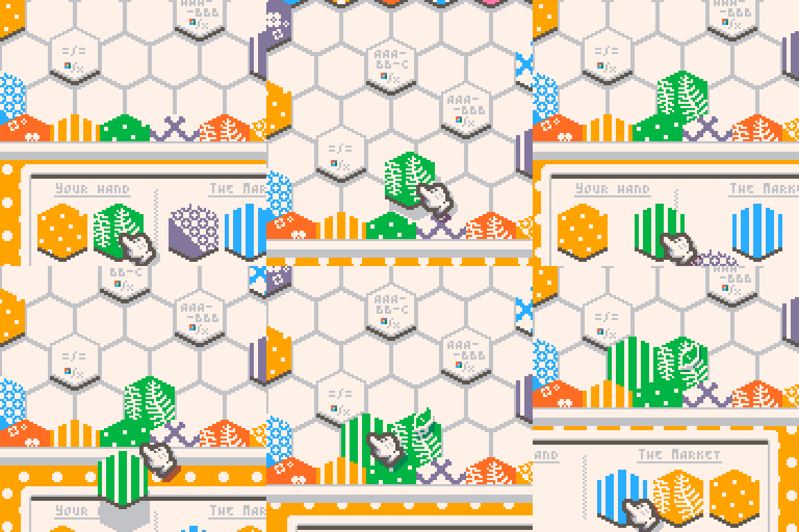
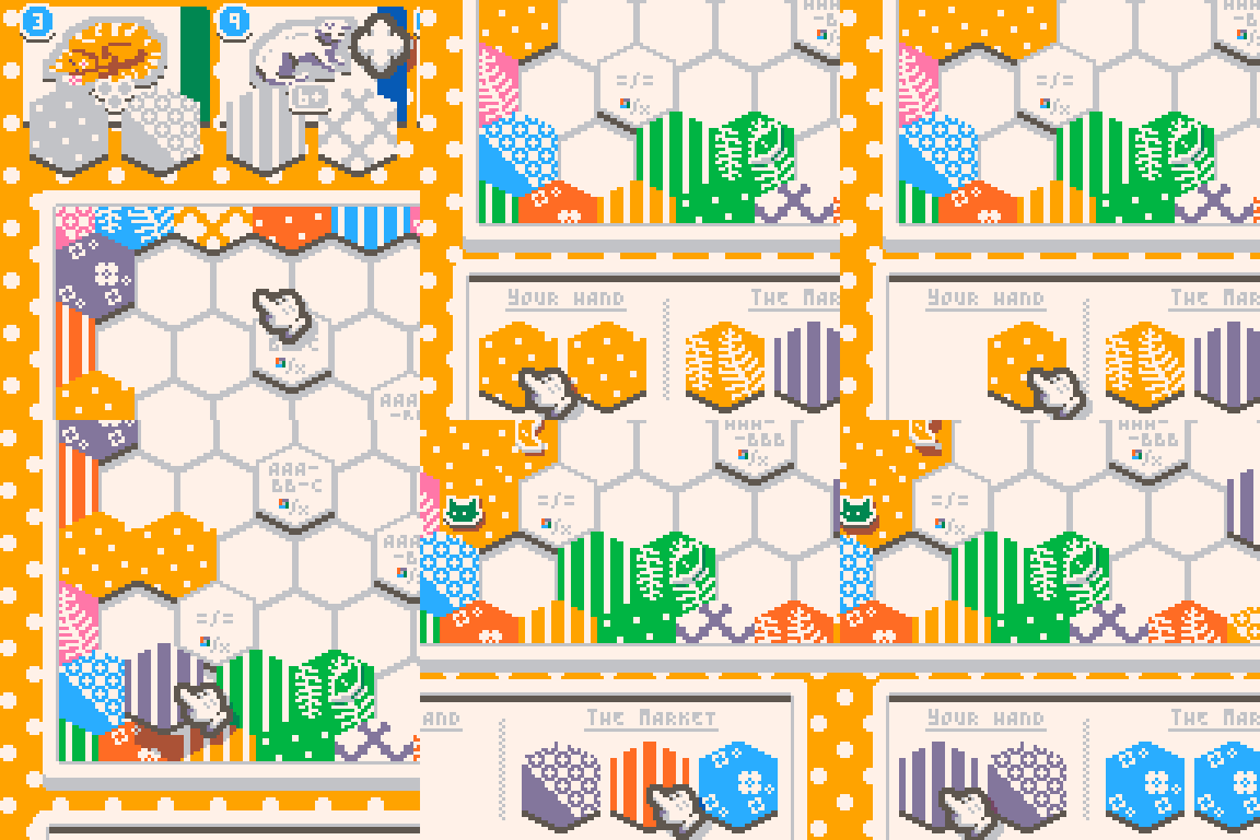
Another condition is the cute little cats on the top of your board. Each little kitty has a requirement, because they are cats, before they enter your quilt. For example, Garfield is tired after all the lasagne but only wants to rest on “dotted” or “half-half” (not sure of the original name, but the solid on half, crossed on the other) tiles.
That in itself is not enough, because you can see a little formation icon showing a downward triangle of three tiles. This means that Garfields want to rest on a group of three of those specific tiles. You cannot mix the two, so it either has to be a full “dotted” or a full “half-half”. Some cats are pickier, if you see a 3+ or a 7+ that means that the cat wants a group with that amount of tiles in it.
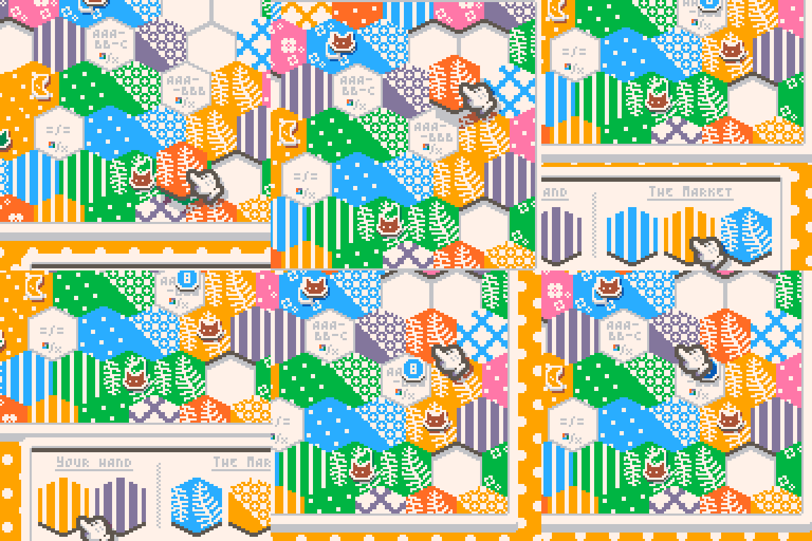
The last one is the board conditions. These can be quite varied, so hard to explain, but you are presented with a requirement around that tile. For example, an AAA-BB-C means that the six surrounding tiles have to be the same 3 then a different 2 then a different 1. In this game I had an AAA-BBB, so we surrounded it with 3 “half-half” tiles and 3 “tree” tiles. If you manage to complete the goal for both colors AND patterns at the same time you get the bigger yellow point value!
But how do I gain tiles?
That is very easy. Your hand will always consist of a starting 2 and after placing a tile onto the board, you will be able to pick one from a random selection of 3 from the Market! But be careful, upon choosing one of your selected tiles because the one furthest to the left is also replaced with a new one, so you will have to carefully maneuver around what you want to place on the board and what will disappear in the next few turns.
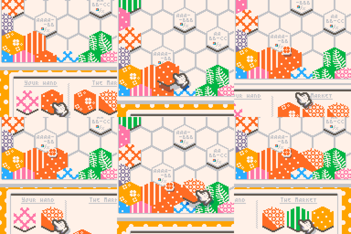
This loop will continue as long as you have space on the board. After you fill in the last place, the game will end, and calculate your total points on the board based on buttons, cats, and surrounding tile points.
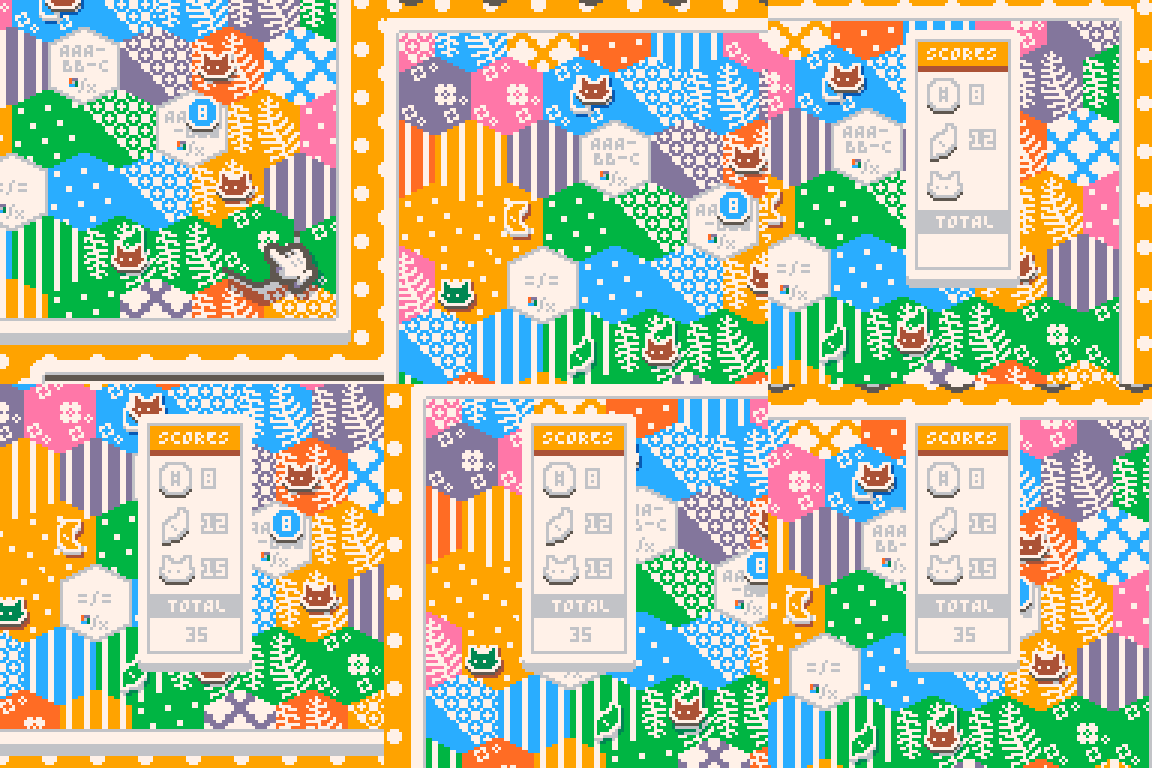
So let's talk about how the game looks. Oh my god, I love it. The colors are vibrant, the variants look cool in this lower resolution…and the cats! The cats look amazing for such a small sprite size they are drawn in.
The user interface (UI)….If you aren't familiar with Louie, he is the master of UI in the PICO-8 community hands down. Slick, smooth, responsive. It's a joy and a half to control the game!
The music is a soothing little song in the background, you could imagine yourself in a log cabin, sitting in front of a crackling fire, sewing your own quilt while cats purr around you—Chef's kiss.
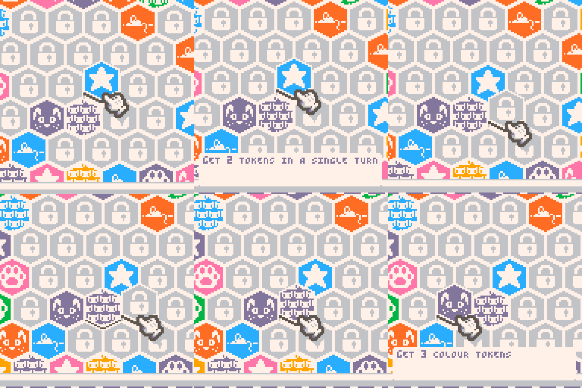
If you are a completionist you will love the game as Louie even added a challenges menu, which contains hidden achievements! Gotta catch them all!
Now onto little negatives, because I have a few gripes with the game, but nothing major!
If you are not a native English speaker then I think the tutorial is way too fast to read. The other, which might just be me being dumb, is that after picking a new tile, there is no clean way to put it down. My way of doing it is tapping on the ?️ button to pan the screen, which will empty your hand basically. After writing this I just realized you can use the arrow keys to move left-right and that will also empty your hand. Silly me.
Man, this game is amazing. It captures the same cozy, relaxing vibes as Krystman's Shape of Mind. If you are feeling down, put on this game. If there is rain on a weekend, put on this game. If you want to have a good time, put on this game. It's the perfect V I B E to turn off your mind and just chill out.
What are you waiting for? Go ahead and try it out today!
About the Author
I stream PICO-8 gameplay and PICO-8 game development on Twitch, as well as write detailed dev logs and a game review series called "Pico Shorts".
Thanks for reading!
On Integrating Sound Effects with Music Compositions
by LokiStriker
Just like art, making music is a separate skill to programming, and because of this, it tends to be easily overlooked until the last minute. Meanwhile, sound effects (or SFX) tend to be added as they are needed without much consideration for the music that will play alongside them.
In this article, we will look into how to make sound effects fit with more charm and character to the music of your games.
1. The Necessary Basics
For being able to understand this article to its fullest, there are two necessary pieces of information that are required: musical scales and musical keys.

What is a Musical Scale?
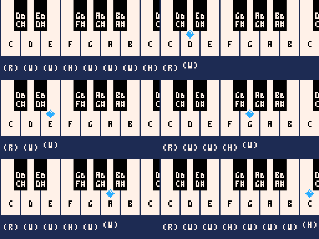
Let us take a piano, which is a repeating sequence of 12 keys. Let us just focus on these 12 keys. Each key has a name and a note it produces when played, but let's just look at the white keys for a moment. There are 7 of them, which incidentally are the keys of a "C major scale".
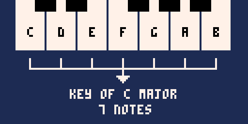
A scale is a collection of 7 specific distances. These distances are defined by how many keys you have to move to get to the next one, including the black keys. Moving, up or down, one key gives us a "semitone" or "half step" (H), and moving two keys gives us a "tone" or "whole step" (W). The "Major Scale" is made of the following distances moving up.
(R) (W) (W) (H) (W) (W) (W) (H)
What is a Musical Key?
A musical key is a collection of 7 notes, starting from any note and applying the distances of a scale to it. If we start on C and apply the distances of a "Major Scale", we get all the white keys. That is why we call it the "C Major Scale".
As scales can start from any note (also known as the “root” of the scale), we usually talk about their notes in the context of their distance from the root, when moving up the keys.
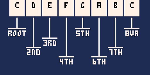
Starting from the root, to the 2nd, 3rd, and so on up to the 7th. After this point, we will find the same notes of the scale being repeated once more.
One notable name we use to describe a note that has the same name as the root, but in a higher or lower pitch, is the “Octave” (written as “8va” in music notation). Octaves are always found 12 keys (or half-tones) apart from each note. When we talk about scales, the octave will be mentioned in the context of the notes leading to it, be it a “higher octave”, or a “lower octave”.
Each note within a scale has a "role" when composing melodies and harmonies, but in the same way, we can also apply these principles to making sound effects.
2. Integration of SFX with Music
While this topic is vast and the resources are not necessarily broad, I can give you some examples that I've used in my games in how I've made the SFX fit my music.
2.1 It's All Notes
Making SFX within Pico-8 involves using instruments and notes. Matching these notes to those found in the key of our song allows for the sound effects to be part of our music. We can think of each SFX as part of the song which is played as the game progresses, be it through player actions or game events.
The main part of integration is knowing which notes of our scale to use for each of our effects.
2.2 The Safe Bets
There are two notes within our scale that most of the time will fit flawlessly inside our game: The Root and The 5th.
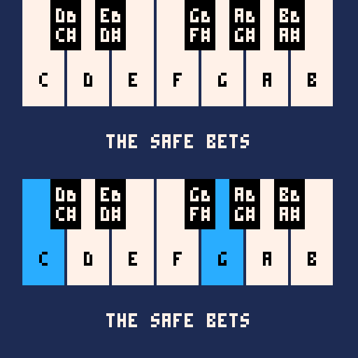
By default, the root is the note at the "center" of our key, so it has a place at any point within our music. The 5th, as well, has a strong relationship to our root note. Using these two notes together will cause the least amount of friction in our music.
I have used both the Root and the 5th to make SFX that will be repeated constantly throughout my game in order to have these sounds complement the music, instead of clashing against it.
Some examples:
In "Beckon the Hellspawn" (BtH), the sound effect switches between the root and the 5th. When the player hits the enemy, it plays the 5th, and when the player picks up the experience points, it plays the root.
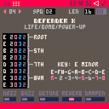
In "Defender X" (DefX) the bullet that the player shoots uses both of these notes as well because this is the most frequent sound the player will be hearing.
Use these notes for sounds that will be used often and repeatedly, so they can blend better with your music.
2.3 Melodic Momentum
Each one of the notes found within our scale can have a different impact when heard within the context of our music. While this “impact” is highly dependent on multiple factors, one notable example relating to our root note is the property that both our 2nd and 7th notes have. This property is something I call “Melodic Momentum”.
When moving from the 5th and playing either the 2nd or 7th notes usually likes to be followed by the root note.
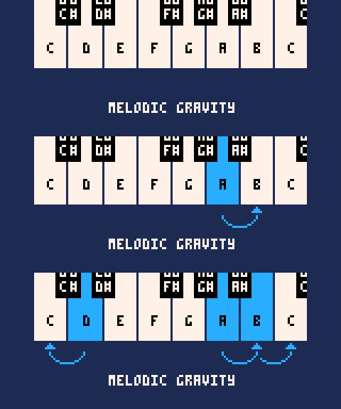
While the 2nd has some interesting properties, let's look at the 7th for this set of examples.
Using the 7th as part of an SFX can make the journey up to the octave have more momentum, pull, or gravity, making that journey “smoother” but still “energetic”.
In DefX, I use this for the sound to start up a game, and whenever you get a power-up, extra life, and bomb because this effect makes the player notice a change in the game, while keeping its attention to it.
In BtH, I use this same idea for my "Level Up" SFX, but I start on the 6th, move to the 7th, and end on the Octave. This "3 note movement", helps evoke that upward, energetic feel.
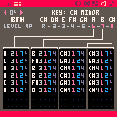
This has the effect of upwards momentum you want to have for things that lift the player: victory sounds, level-Ups, and pickup sounds. This idea is used throughout the history of video games.
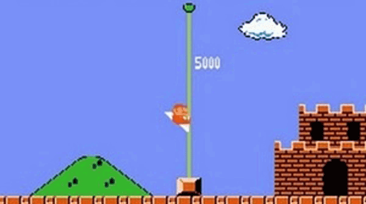
One classic example is the “Level Complete” short music that plays in Super Mario Bros. after you touch the flag at the end of the level.
2.4 Intentional Dissonance
Now that we have established which notes are within our scale, we can think about how we can use the other notes.
These notes will stand out the most but in a very drastic and sharp way. The most prominent effect I can give is how in BtH, when the player is hit, the SFX plays a 5th but down a "semitone" (known as a "flat 5th").
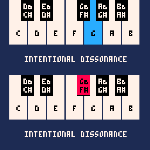
This note is very dissonant, so it stands out to the player the most, informing them that they have been hit.
We can use notes such as this to inform the player of important information by shifting their focus toward the source of such effects.
Be warned, due to the dissonance, you must be careful when to use such notes. In measure, these notes can be used to great effect, but use them too much and you will irritate your players.
For other references, one notable example is "Super Mario Odyssey''. Here is a link to a small showcase of how they go about it. This is a more complex and integral design, but it's an excellent point of reference for this topic:
Sounds in Super Mario Odyssey Harmonize with the Background Music
I hope this material has helped you in maybe understanding a bit more about music theory and its applications in making games sound better. You can check out both of the games I've mentioned throughout this article at my Lexaloffle Profile.
Neon Sprites
by NerdyTeachers
When you look at the PICO-8 Palette, neon lights are probably not the first thing you think of. It certainly wasn't for me. But one day, I was aweing some digital art that all had a Cyberpunk or Tron aesthetic. For example:
![]()
As I looked closer at what made this style really pop, I realized it may be possible in PICO-8 and was inspired to try to recreate it with the PICO-8 palette. I experimented a bit and ended up with this mockup:
![]()
The process of experimenting helped us learn a few tricks to pull off the style.
1. Ultra-high Contrast
If we separate the PICO-8 colors by darkest and brightest we get something like this:
![]()
To get the highest contrast, you simply place the darkest colors next to the brightest colors. The darkest color is black (#0) and the brightest is white (#7). So to get the best result, try to keep black (#0 ) as much of the game's background as possible and use white (#7) as the center of your neon sprites.
I found that I should avoid those middle colors (#4, 5, 6, 13, and 15) as they tended to lower the contrast and lose the effect in most cases.
2. Colorful
Ultra-high contrast alone will simply give you a black and white game. So one of the more obvious but necessary requirements is to also make it colorful! The PICO-8 palette has high-saturated colors (#8, 9, 10, 11, 12, and 14), making it perfect for this style.
So take any of those colors and wrap them around a white center to make them appear even brighter.
The colors in checks (#8, 9, 14, 11, and 12) create the best effect in our opinion. You can see how dull the colors in Xs appear. Off to the side, we separated yellow (#10) and peach (#15) because even though by themselves they appear bright and colorful, they are actually too bright and too close to white, so the contrast is too harsh and they look washed out, less colorful.
3. Glow
To really pull off the neon look, you need to make it appear to glow and send light out into the dark world. So we want to fade away from the bright colors down into a darker version of that color before getting to black.
![]()
We can even fade it out one more step by using the closest color to black, dark-blue (#1).
![]()
I found that this works well for static game objects, or bigger objects that would cast more light. But if we do this too much, then it will remove the high contrast by putting too much distance between the black and the bright color. The glow should be a quick fade into the darkness and dark-blue (#1) can actually work with any of the colors directly like this:
![]()
This works better for moving sprites where you want to keep high contrast for better visibility, especially for smaller sprites.
4. Flicker
We can't forget that we have more tools in PICO-8 and game development in general than still art. So one thing we can add to any sprite is of course, animation! The final touch to make a neon light sprite is to animate it by making the colors flicker on and off, or pulse brighter now and then.
Don't Draw Every Pixel, Use a Function!
Let's make it easier by turning these ideas into code. We've created a function that you can use to draw neon sprites from any pure white sprite you want! For example, this is our sprite sheet turned neon using just one custom function, neon_spr():
See this month's Prototype Party below to get the neon_spr() function and turn any white sprite into a glowing and flickering neon sprite!
Random Reviews
Game Recommendations on
New Releases: March 2023
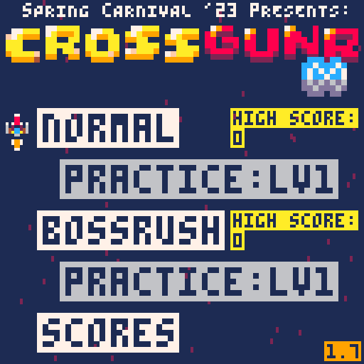
CrossGunr: Infinite
"This is another instant classic from AKTANE. This shmup really pushes the limits of the PICO-8, even more than its predecessor, the original Crossgunr, did. It's addictive to keep pushing for higher scores. A must play game, especially for anyone who likes shumps."
-Castleview
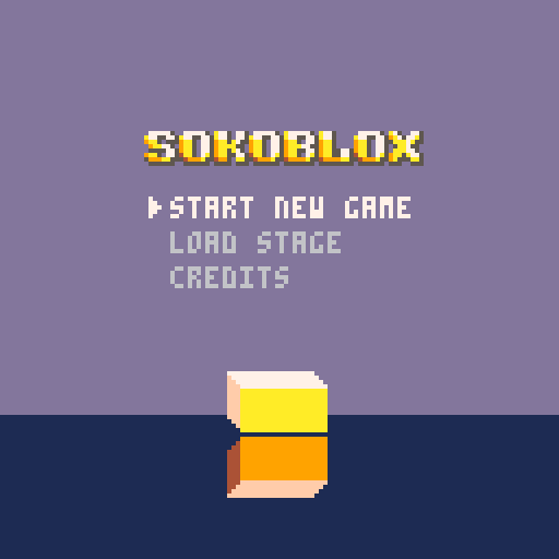
Sokoblox
"This is really great. I love the way that each level shows you how one mechanic works. It feels really focused and polished."
-ohhcurtains
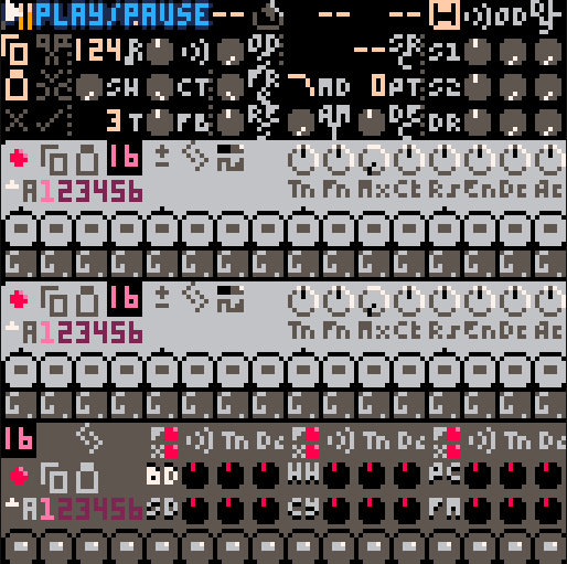
RP-8
"Making music on handheld devices is always a blast for me, and RP-8 is a surprisingly deep synth toybox for PICO-8. I enjoyed fiddling around with this, and there's even an export function for sonic creations."
-Schoonsy
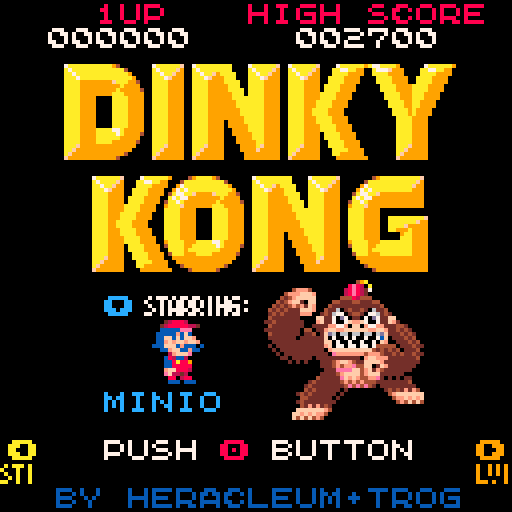
Dinky Kong
"A true classic that I'm grateful to see has been brought into the PICO-8 cartverse. I loved playing the original DK on both the arcade and the gameboy. The nostalgia of replaying these levels is strong with Dinky Kong and that is entirely due to the amount of care and detail with which it was remade here. An absolute joy to play."
-NerdyTeacher J
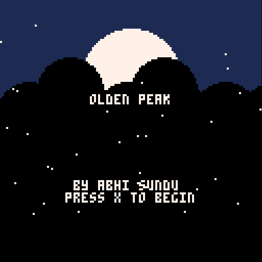
Olden Peak
"Olden Peak gave me a great experience. The combat was fun and smooth, and I kinda wish for a sequel of some sort."
-TroubledKarma56
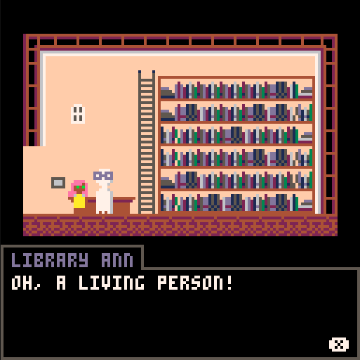
Last Words
"It was a cute little game :) It's a game about going around and listening to the last words of people who had died, before they pass away. I enjoyed walking around and listening to what the characters had to say. They all had their unique identity, a life before they died, things they wanted to do... It was nice. The character art is adorable, and the sun setting is a nice touch :D Give this game a go if you have some time to kill, and want to have a smile. It's really short, but very sweet."
-Glimm
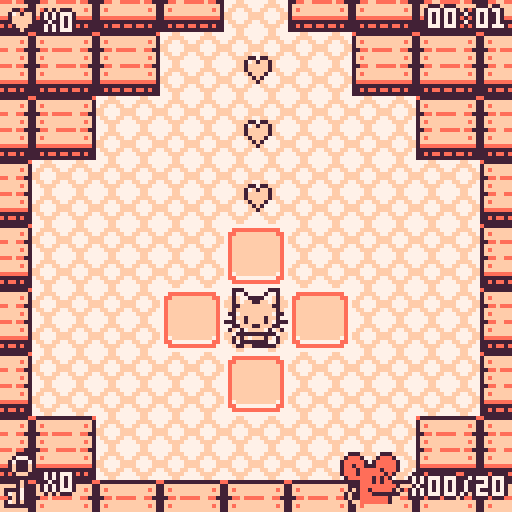
Feline Frenzy
"A short, adorable maze-based puzzler. The premise is simple: you are a cat and you want to collect all the mice. The graphic style is cute and GameBoy-esque, the difficulty ramp is gentle but satisfying, and the game lasts just long enough to do justice to its simple puzzle mechanics. Tightly conceived, nicely executed, and who doesn't love a cartoon cat?"
-luchak
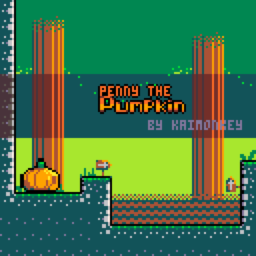
Penny the Pumpkin
"Penny the Pumpkin is an extremely charming platformer from a first time creator. The animations are lovely and the game is really well presented. It uses large character sprites that have a very distinctive wobble animation applied to them. This makes the platformer feel quite distinct."
-SquidLight
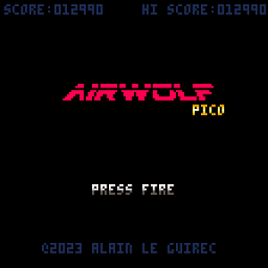
Airwolf Pico
"A meticulous remake of the infamous 80's Amstrad CPC game, but with improved controls and scrolling makes it a retro delight."
-Godmil
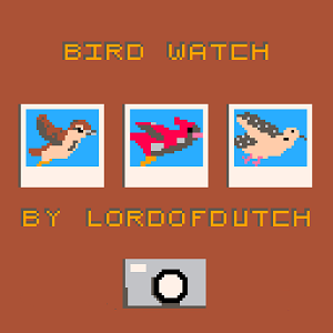
Bird Watch
"'member when Sony made phones? 'member when covid wasn't a thing? 'member having less wrinkles and playing Photo Quest? You can have that today by snapping photos of the fish of the skies...the birds.... Thank you, lordofdutch!!! Really enjoyed playing."
-ricsidiscord
Pixel Art Gallery
Artist Spotlight: Jusiv
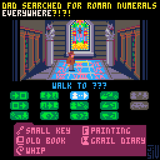

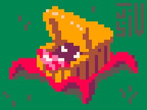
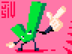
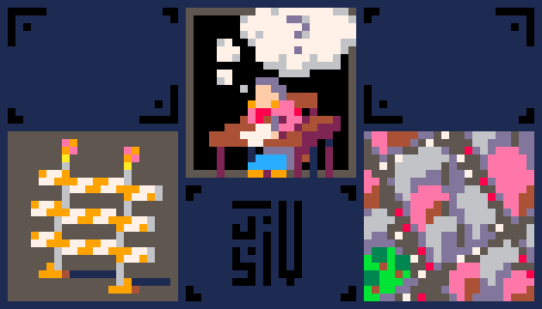
Jusiv is a game developer and pixel artist who has been making submissions for every single prompt from the Pixel Dailies daily art challenge for over 5 years (and counting). You also might know him as the developer of quite a few PICO-8 titles, most notably FUZ, a demake of the indie title FEZ.
He draws his own sprites for his solo gamedev work and frequently uses the standard PICO-8 palette in his pixel art, some recent samples of which are shown here. Many of his Dailies pieces center around unconventional and often very literal interpretations of the themes.
Jusiv posts about his art and game development both on Twitter as @Jusiv_ and on cohost as @Jusiv.
Tweetcart Gallery
Prototype Party
Each month, this section of Pico-View will bring you a prototype with a focus on a unique mechanic or style. You can take the challenge of putting your own spin on this prototype. Feel free to take the code from here and use it in your next game!
This month's prototype is named "Neon Sprites". Read the above article of the same name for details.
The neon aesthetic works well in games that are futuristic or located in high-tech mega cities. We hope this inspires some creative new games, so take the neon_spr() function and see what you can do! Try it out right here!
We challenge you!
Take this prototype as a jump-off point to practice your skills, and add your own flavor to it. The only requirement is to keep the visual style of neon lights! Here is the function you need to turn white sprites into whatever color neon sprites you want.
function spr_neon(sp,x,y,c1,c2,w,h,flpx,flpy)
	--default values for optional arguments
	local w = w or 1
	local h = h or 1
	local flpx=flpx or false
	local flpy=flpy or false

	--flicker effect
	if (flash and rnd(10)>9.5) c1+=1

	--c2 dark outline
	pal(7,c2)--set dark color
	spr(sp,x-2,y,w,h,flpx,flpy)--left
	spr(sp,x+2,y,w,h,flpx,flpy)--right
	spr(sp,x,y-2,w,h,flpx,flpy)--up
	spr(sp,x,y+2,w,h,flpx,flpy)--down

	--c1 light outline
	pal(7,c1)--set bright color
	spr(sp,x-1,y,w,h,flpx,flpy)--left
	spr(sp,x+1,y,w,h,flpx,flpy)--right
	spr(sp,x,y-1,w,h,flpx,flpy)--up
	spr(sp,x,y+1,w,h,flpx,flpy)--down

	--main sprite
	pal()--reset colors
	spr(sp,x,y,w,h,flpx,flpy)
end
How to Share
You can post your spin-off on the BBS, tweet it with the hashtag "#picoview", and join our Discord community if you have questions or want to share your progress. Here is the game cart with everything you need to get started!
![]()
If you don't own PICO-8, you can still join in the fun and add to this prototype in the PICO-8 Education Edition by following this link:
Closing Remarks
Hello one more time to whoever's eyes this finds. Thank you for reading the March issue of the Pico-View web-zine! We hope you enjoyed all of the articles this month. Here are the folks who helped piece the zine together one pixel at a time...
-Chaneburgerz - Cover Art
-Jangus Dunch - Article Writing
-SquidLight - Article Writing
-Achie - Game Review & Article Writing
-LokiStriker - Article Writing
-Jusiv - Pixel Art
-NerdyTeachers - Zine-Coordinator, Organization, and Article Writing
-Achie - Emotional Support
-Castleview, Ohhcurtains, Schoonsy, TroubledKarma, Glimm, Luchak, Ricsidiscord, Godmil - Random Reviewers
-Numa, Michał Rostocki - Tweetcarters
Thanks to all the authors, contributors, and readers for supporting our Pico-8 zine! If anyone would like to write an article, share pixel art, or help with anything contact @Marina Makes or @NerdyTeachers on twitter or Discord.
-Marina Makes
18258
31 Mar 2023


